
News and Events
The Latest
-
April 15, 2024 MLB The Show celebrates Jackie Robinson Day
-
April 14, 2024 MLB The Show 24: Game Update 5


Schedule
04.23
New Conquest Map
04.26
First Roster Attributes Update!
04.26
New Mini Seasons
04.26
The Show Classics Program
04.26
New Event and Ranked Program Update
Game Modes


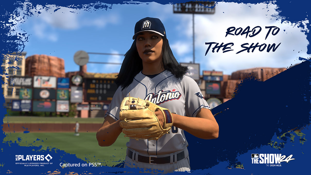
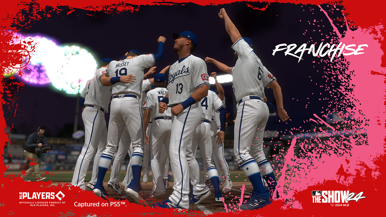
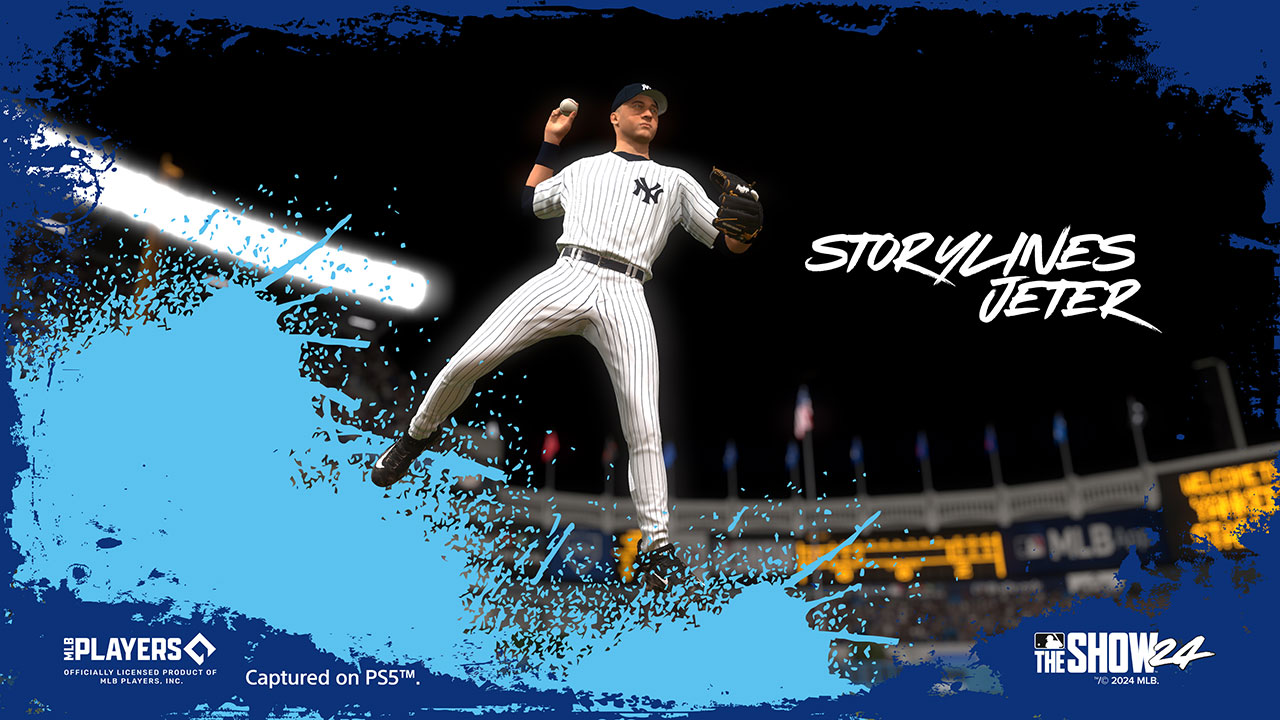
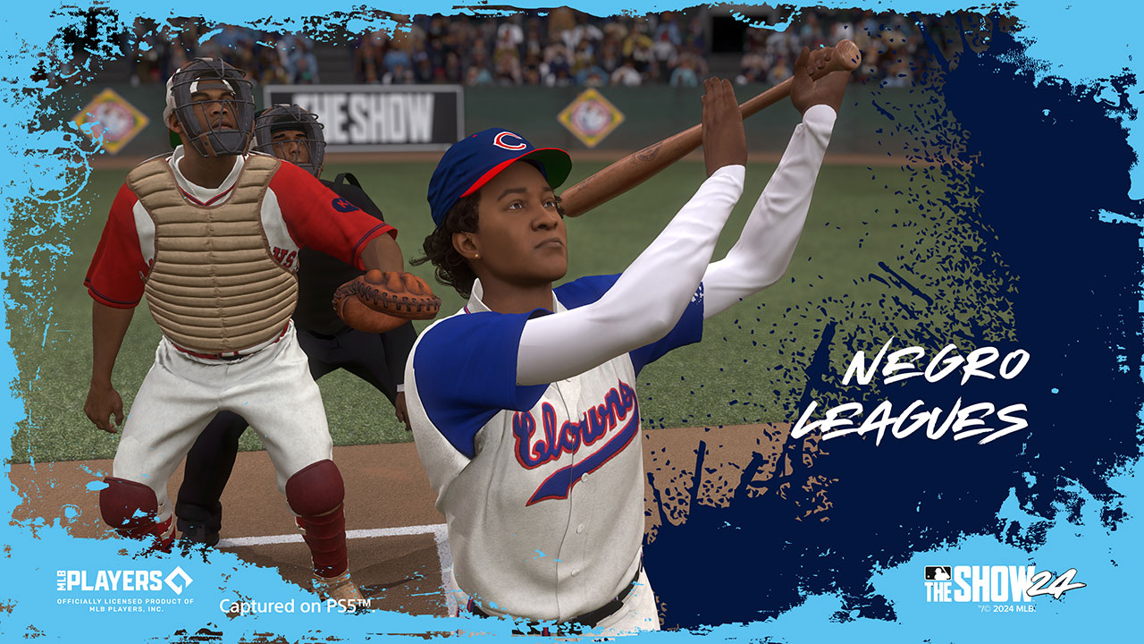
The Show
On the Go

Companion App
Get the Companion App
The MLB The Show Companion App provides a complimentary experience for MLB® The Show™ 24.
![]()
![]()

Scouting Report
Get the Latest Info
Want all the latest information on MLB The Show directly from the team at San Diego Studio? Then make sure you join the MLB The Show Scouting Report.